In securities trading, charts are a representation of an asset’s price movement using a graph. This chart displays the ‘trend’ that an asset displays over a period of time which enables a technical trader to predict future price movements. It would not be an exaggeration to say that these charts are the crux of technical analysis.
Why Is It So Important?
Charts show the history of the asset’s price. These trends tend to repeat themselves as educated traders analyze these trends and take trades to earn profits. With dedicated study and practice, anyone can learn and interpret charts to earn money from the financial markets.
Types of Charts in Technical Analysis
There are 3 mainly used charts and 5 other charts that traders use when trading.
Main Types of Charts: -
1. Candlestick Charts:
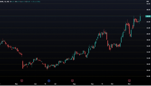
Candlestick charts are the most important charts when discussing prices of financial securities and were developed in ancient Japan. The chart depicts small ‘candles’ which represent a certain time frame.
Shown above is the Candlestick chart of Punjab National Bank, an Indian public sector bank. This topic is of paramount importance and is discussed in greater detail in a different blog.
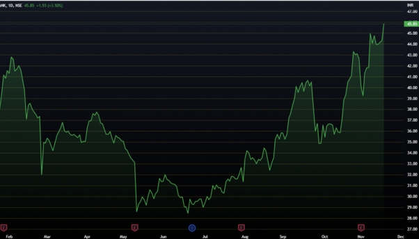
2. Line Charts:
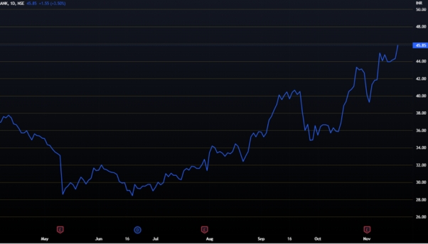
A line chart is the most basic type of chart which depicts the historical price of a security and connects a series of data points with a continuous line drawn from the left to the right. A great advantage of the chart is that it helps us clearly see the trend of the financial instrument, marks important support & resistance zones with relative ease, and is beginner-friendly
The chart shown above is the line chart of Punjab National Bank. The line shows the historical price of the bank and how its price has moved. A drawback of the line chart is that it does not show the movement of the stock during a time frame, but only at the end of a time frame. Here, the line chart is formed by connecting the data for the closing price every day. Therefore, they do not provide enough information to veteran traders who engage in short-term trading and need data to test their strategies.
3. Bar Charts:
A bar chart is another commonly used chart that uses ‘bars’ to depict the four prices that any financial instrument touches on a time frame: Open, High, Low, and Close. As such, a bar also called an OHLC chart.
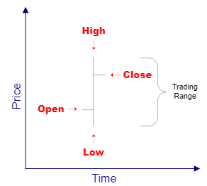
The image shown above depicts a single bar and the four prices it represents. If a bar is green, it indicates that the price of the security closed higher than its opening price, meaning it ended positively at the end of the time frame. However, if the bar is red, the opposite is true.
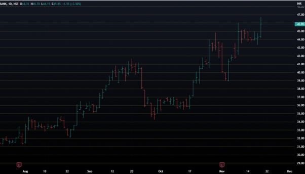
Another important thing one can note is that if the body of the bar i.e. the line between the High and Low, is too long, it indicates that the price moved a lot during the time frame and that volatility during the period was high. The figure below shows the bar chart of Punjab National Bank.
Other Frequently Used Charts: -
1. Point and Figure Charts:
Unlike the three charts mentioned above, the Point & Figure Chart (PAF) uses columns of Xs and Os. The Xs represent rising prices while the Os represent falling prices. The following chart is the PAF chart of Punjab National Bank which is representing the movement of the price of the bank’s stock in the strange X and O format.
PAF charts are normally used by experienced traders since they provide different trade and trend signals as opposed to candlesticks and bar charts. They are most commonly used to confirm breakout signals but are normally slow to react to price changes. Thus, these charts are rarely used and are too complicated for beginners to understand.
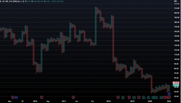
2. Kagi:
Another notable contribution of the Japanese to the financial world is the Kagi chart. It was developed in the late 1800s. These charts do not change direction at the end of a time frame but at a price reversal. The chart will continue to move in that direction until there is a confirmed price reversal.
Since these charts follow no concept of time and focus only on the prices, they tend to filter out the noise (irrelevant market movements), thereby allowing traders to isolate the trend of the stock and view the direction of the stock more clearly.
3. Area Charts:
Area charts are fairly similar to line charts. They connect the closing prices of the stock charts using a line and display the price trend of the stock. However, the area chart is also different in a way. The space between the trend line and the X-axis is filled in with a particular color.
Normally, the area charts give a reading on the quantity but that is not the case for financial securities. The colour of the area ends up as green when the closing price of the security is higher than the closing of the previous time frame. It ends up as red if the price of the stock closes at a lower price.
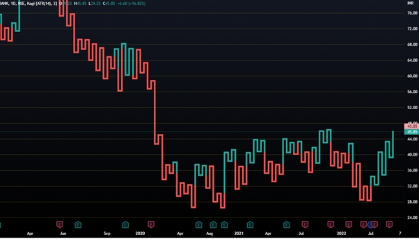
4. Baseline Charts:
Baseline charts are similar to Area charts but are somewhat different due to their use of a Baseline as shown in the chart of Punjab National Bank below.
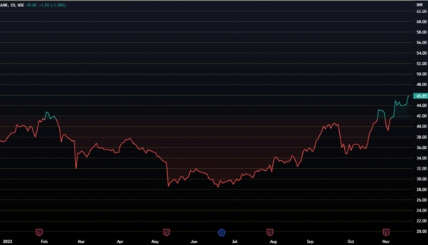
A Baseline can be defined as a set point that is used as a reference for comparison. In the Punjab National Bank Baseline chart shown above, the baseline price of the stock is Rs 42. The price of the stock, which has been below Rs 42 for almost a year, is clearly shown below the baseline in red. However, recently the stock has moved up near Rs 45 per share and the same is being shown in green i.e. above the baseline.
5. Heikin Ashi:
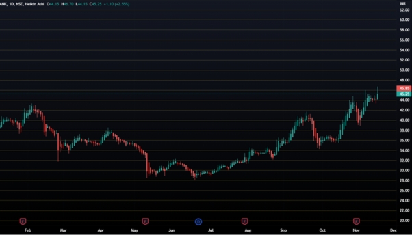
The final type of chart in our discussion is the Heikin Ashi chart, another important contribution by the Japanese in the field of Technical analysis. The term “Heiken Ashi” is Japanese for ‘average bar’.
Heikin Ashi is similar to a candlestick chart but is different in a few aspects. This chart is smoother since it takes an average of the movement. Moreover, this chart stays red or green depending on whether the stock is in an uptrend or downtrend, unlike the candlestick chart which changes daily.
However, there is a grave issue with this type of chart. Since it takes the average of the movement, the price does not match the current trading price of the asset. Therefore, traders are unable to view the current price of the asset. However, to counter that, some trading platforms show two price bars, one for the current trading price and the other for Heikin Ashi.
The ones shown later are not generally used but are useful nonetheless. This concludes our discussion on the different types of charts.
FAQs
1. Why can’t we just use Line Charts?
For simpler purposes, such as monitoring the trend, you can. However, Line Charts filter out critical information such as the highs and lows of the asset in the timeframe. How high or low an asset went before ultimately closing is important to realize the dominant force in the market and is extremely important for technical analysis.
2. How is Heikin Ashi used?
Although this chart also uses candlesticks, it is very different when compared to a normal candlestick chart. Unlike the normal candlestick chart which is a combination of ups and downs while recording actual prices as they occur, a Heikin Ashi chart filters out the useless information. It is easier to spot market trends in this chart while making it easier to predict future prices.
3. Do candlesticks work in all markets?
Absolutely. From Equities to Commodities and even Crypto! Candlesticks aren’t simply limited to the price of one particular asset. Its practicality makes the chart a particularly useful tool in understanding price trends and understanding market sentiments.
4. Is there anyone who does not use candlesticks?
Of course. Many people tend to use the Heikin Ashi or the Baseline, maybe even the PAF charts! The charts are used to represent prices in the markets while helping them forecast future possibilities. So, people use whichever chart they are most comfortable with. Most use the candlestick chart due to its ease of use and particularly clear indications.
5. Are candlesticks easy to learn?
Not necessarily. Many types of candles combine to give different kinds of signals. Sometimes, many candles come together to make a particular pattern which can help indicate future movements. However, with the right guidance, anyone can learn technical analysis using candlestick charts.
Click on the link below to join thousands of other students who have enrolled in our course!


 1,499
1,499