Candlesticks are one of the most important tools any investor or trader uses to participate in financial markets. Moreover, several things must be discussed when learning about candlesticks, thus needing an entire discussion on this chart.
Origins of Candlesticks Chart: -
The origins of the candlestick chart can be traced back to the late 1700s when a Japanese rice trader named Honma Munehisa was credited with the creation of said chart. He noticed the relation between price and the demand & supply of a good as well as how the emotions of the traders affected the market for the said commodity. Since prices shifted consistently and often swung beyond what was anticipated, he came up with the idea of a candlestick chart.
Some sources suggest that market technician Steve Nison was responsible for bringing the candlestick charts to the Western world after which it was subsequently adopted by all stock exchanges across the world.
As shown in the image, this was the original design used for candlesticks when they were used earlier. Here, a black candlestick represents a scenario where the price of an asset has declined while the white candle shows an appreciation in the price of the asset. However, the candlestick charts currently used are colored. Modern trading platforms use charts where improvements in prices are portrayed using a green color while any decline is shown in red.
Now that we are aware of the history of this miraculous chart, let’s proceed toward improving our understanding of this chart.
What Candlesticks Really Mean in Simple Terms?
The green or bullish candlestick displays a scenario where the price of the stock closed at a higher price than its opening price i.e. price of the stock saw a positive movement. On the other hand, the candlestick on the right represents a candlestick where the price of the stock has declined.
A single candlestick looks something like this.
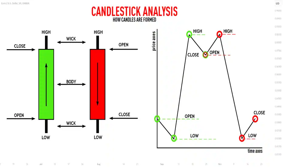
Let’s understand the anatomy of a candlestick chart using the bullish candle on the left for stock trading on Indian bourses. The ‘Open’ price refers to the price at which any stock starts trading at 9:15 on any normal day. ‘Low’ is the lowest price that a stock has hit on any particular day (or any other timeframe) while ‘High’ refers to the highest price the stock. hit on any particular day. ‘Close’ refers to the price that the stock ended up at 3:30 i.e. market closing time.
The excess parts that are visible between the Close and High & the Open and Low are called ‘wicks’ as in candle wicks. The large green part in the middle is called the body of the candle. Often called the ‘Real Body’ of the candle, it shows how much of the price movement during the day was sustained by the end of the closing. It often happens that the stock may touch great highs during the day, but contract back to the opening at the end of the day.
Benefits Of Candlestick Chart
There are several benefits to a candlestick chart:-
- They are better than traditionally used charts like line charts since they represent data more accurately and visually.
- They are easier to understand due to their better visuals. Moreover, with basic technical analysis, anyone can see basic patterns emerge.
- Most importantly, these charts take into account the psychological factors which influence trading. It's called investor sentiment and it plays a vital role in the trading of all items.
- The candlestick shows the market sentiment as well, the color of the candle changes along with the change in prices.
Types of Candlestick Chart
But is this all there is to candlestick charts? Certainly not. Everyone would be a millionaire if this was all there was to the charts. Candlesticks make certain shapes or ‘patterns’ as we call them which indicate a variety of things about the stock, the market, and investor sentiment. Some of the most common single candlestick patterns are:-
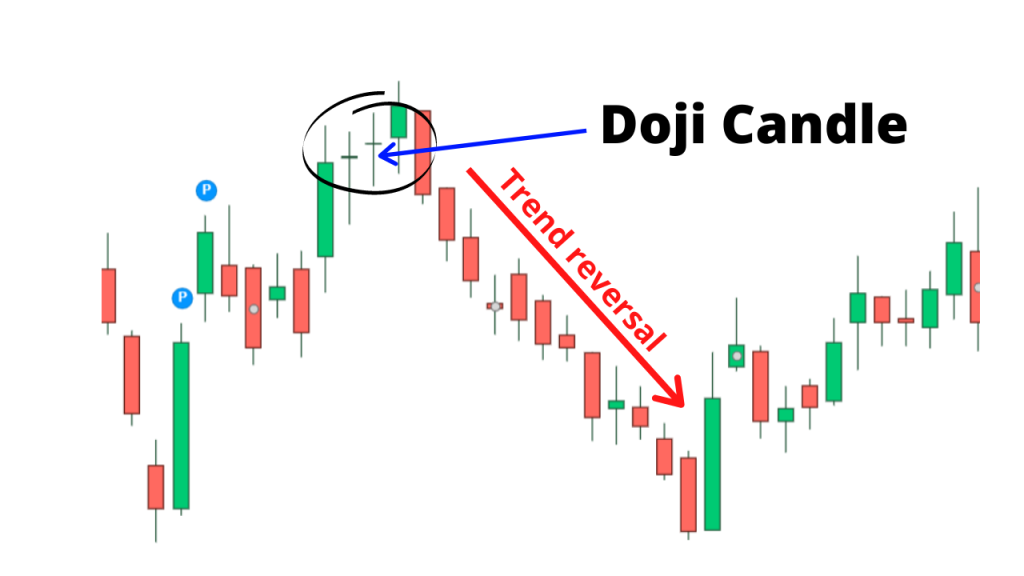
- Doji= A Doji candlestick is a candlestick pattern that indicates indecisiveness. Here, the real body of the candle is almost non-existent and the Opening price is fairly close to the closing price. This happens when both bulls and bears are fighting an intense battle to determine a clear victor buta are unable to properly overpower their opponent. The victor, whoever it may be, wins by a hair’s breadth due to which the body of the candlestick is so small. Such a candlestick can be identified by its non-existent body and long wicks on both sides.
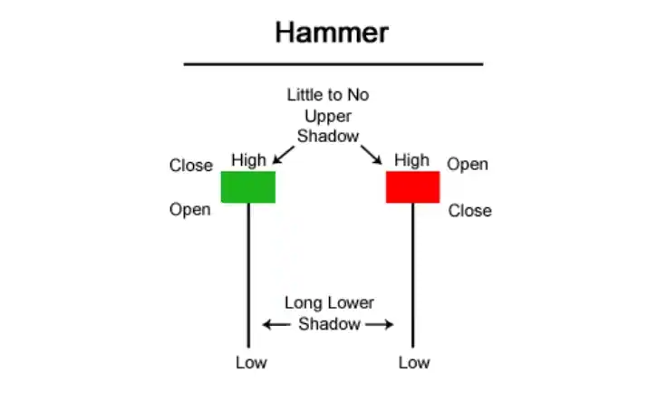
- Hammer= A hammer candlestick, as shown below is a candlestick pattern with a short body at the top and a long lower wick, resembling a hammer. This candlestick is formed in a scenario where sellers came in to drive the prices down but buyers came in and drove the prices back up, thereby resulting in the long lower wick. The candle is green when buyers manage to drive the prices up beyond the open while red when they are unable to break through the opening price.
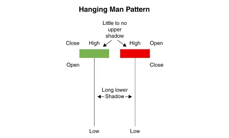
- Hanging Man= Judging by the image displayed below, a hanging man candlestick appears to be similar to the hammer candlestick, with a thin body at the top with long wicks. The market action is also similar to what it was for the hammer candlestick. The most important point of difference, and maybe the only one, between hanging man and hammer candlesticks, is their time of occurrence. A hammer candlestick appears at the end of a downtrend while the hanging man candlestick appears at the end of an uptrend. Both the candles can be used as an indicator of a trend reversal.
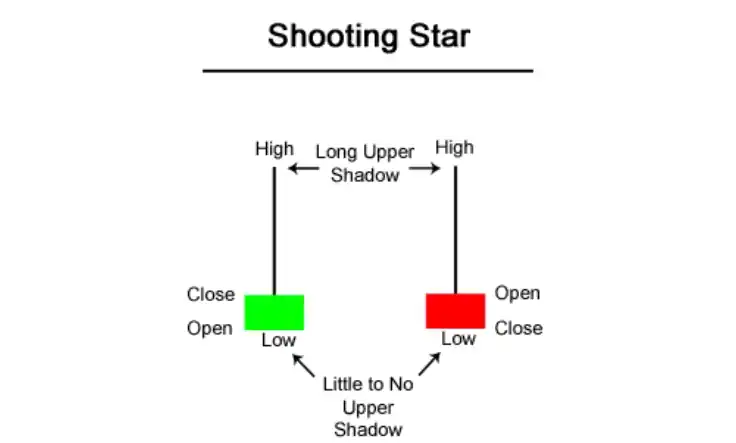
- Shooting Star= The shooting star candlestick appears like an upside-down hammer, real body at the bottom of the candle with long wicks on the top. This type of candlestick appears in a scenario when the buyers are taking charge of a stock and driving it up when the seller suddenly comes in and forces the price down, resulting in the long upper wick.
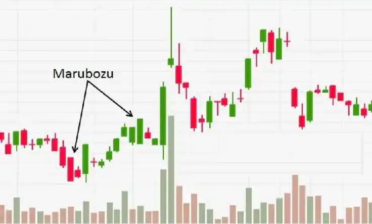
- Marubozo= A Japanese word meaning "closely cropped", a Marubozo candlestick refers to a long candlestick with a long body and a clear absence of wicks. As per this candlestick, on a good day, the opening price is the lowest while the closing price is the highest. On the other hand, the opening price would be the highest, and the closing, the lowest on a bad day. This type of chart indicates that one particular side (Green-bulls, Red-bears) has taken over the stock and the momentum of said nature shortly.
Now, we know about a few candlestick patterns, but this is not the end of it. These are just a few patterns in a very long list of possible patterns. The dedicated study of candlestick patterns is an integral part of Technical Analysis and Price Action trading.
However, the most important thing in Technical Analysis is not the candlestick chart, but the price of the stock. When discussing prices, it is imperative that we as investors set a ‘Target’ and a ‘Stop Loss’. A Target refers to the targeted price that we as investors wish to achieve before stopping our investment activity in a particular stock or a particular time frame. For ex- A person may buy 100 shares of Punjab National Bank for Rs 45 and hold the stock until the stock hits Rs 50. Here, Rs 50 is the target the investor has set for the scrip.
Maintaining a target is important because we as investors need it to determine the extent of our investment. One person may choose to hold Punjab National Bank until it hits Rs 50 per share while another may choose to hold it with a Target of Rs 100!
But what if we purchase a stock and it begins declining? A rookie mistake most investors make is that they keep their funds invested in securities that are declining until they turn profitable. This is where ‘Stop Loss’ comes into play.
Know About Stop Loss
A Stop Loss refers to a price that is below our purchase price which we are willing to accept as a loss. In a declining market, shares could crash as much as 40% from our purchase prices, a significant erosion of our invested wealth. Isn’t it better to accept a haircut of 5% as opposed to 40% and invest the salvaged funds into a more profitable stock? This is exactly what a Stop Loss helps an investor do.
FAQs: -
1. How do traders use candlestick charts in technical analysis?
Traders use candlestick charts to identify trends, reversals, and entry/exit points. They also analyze candlestick patterns, such as hammers, engulfing patterns, and dojis, to make predictions about future price movements.
2. Can candlestick charts be used for different timeframes?
Yes, candlestick charts can be used for various timeframes, such as minutes, hours, days, weeks, or months. Shorter timeframes may reveal intraday price movements, while longer timeframes show broader trends.
3. How are candlestick charts different from other types of charts?
Candlestick charts provide more detailed information compared to line charts or bar charts. The visual representation of price action helps traders interpret market sentiment and make more informed decisions.
4. What is the significance of candlestick patterns?
Candlestick patterns are formations created by one or more candlesticks on a chart. They are used by traders to identify potential trend reversals, continuation patterns, or signals for entering or exiting trades.
5. How can I learn to interpret candlestick charts effectively?
Learning to interpret candlestick charts effectively requires practice and education. There are many resources available online, almost too many. Choosing a reliable source to learn it accurately is most important.
Click on the link below to join thousands of other students who have enrolled in our course!


 1,499
1,499